Outlooks: A Joyful Display Font for Digital Branding
It started with a hero section. I was redesigning a boutique coaching website—clean, intentional, warm—and the client wanted “something that feels like sunshine in type.” Not playful in a childish way, but joyful, grounded, and unmistakably human. That’s when I dropped Outlooks into the headline: “Your Next Chapter Starts Here.” Instant lift. Like the whole layout took a breath and smiled.
What Outlooks Brings to the Screen
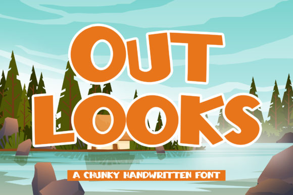
Outlooks is a chunky, hand-drawn display font with generous spacing, soft curves, and a gentle bounce in every letterform. It’s not rigid or overly geometric—it has rhythm, warmth, and quiet confidence. As a display font, it’s built for impact, not endurance: perfect for moments where you want users to pause, connect, and feel something before they even read the full sentence. I tested it across devices and contexts—desktop headers, mobile banners, dark-mode overlays, image-backed CTAs—and it held its personality without sacrificing clarity.
Where It Shines (and Where It Doesn’t)
In practice, Outlooks excels in high-visibility, low-density spots: hero headlines, section titles, call-to-action buttons (“Start Free Trial,” “Join the Circle”), testimonial quotes, and campaign banners. On a product landing page, I used it for the main value proposition above the fold—and paired it with a clean, neutral sans serif (Inter, set at 18px) for body copy. The contrast created instant hierarchy and emotional resonance without visual noise.
It’s less effective—and I say this after testing—on small UI elements: form labels, navigation links, footer text, or anything under 24px on desktop or 20px on mobile. Its chunkiness needs room to breathe. Likewise, avoid long paragraphs or dense feature lists. This isn’t a workhorse font; it’s a spotlight font. Use it where attention matters most.
Responsive Behavior & Real-World Readability
I ran three quick checks: first, on a 375px mobile viewport with Outlooks at 32px (scaled with clamp() for fluidity); second, over a textured background image with 60% black overlay; third, in dark mode with light text. In all cases, legibility stayed strong—no blurring, no rendering hiccups, no unexpected kerning collapses. The font’s generous x-height and open counters helped significantly on smaller screens. Just avoid ultra-thin weights (if available) or tight tracking in responsive settings—Outlooks wants breathing room, especially on touch interfaces.
One note: if your project supports multilingual content, verify language coverage early. I confirmed basic Latin support (including accented characters for French, Spanish, and German), but didn’t test extended Cyrillic or Asian scripts—always check the foundry’s spec sheet before launching globally.
Pairing With Purpose
The magic of Outlooks multiplies when paired intentionally. For digital products rooted in calm and clarity—a mindfulness app, a creative course platform, or a slow-living blog—I leaned into contrast: Outlooks for headlines + Inter or Manrope for everything else. The result? Friendly authority. No tension, no competition—just clear roles.
For more editorial or boutique-leaning sites (think a curated design shop or a writer’s portfolio), I tried pairing with a subtle serif—like Playfair Display for subheads and Outlooks for top-level banners. That combination added texture without clutter, giving the site a tactile, almost print-inspired quality—even on screen.
What *doesn’t* work? Overloading with another decorative font. Avoid stacking Outlooks with a script or handwritten typeface unless you’re designing a very specific seasonal campaign (e.g., a summer workshop flyer). Simplicity is its best collaborator.
Licensing, Formats & Practical Integration
I downloaded the webfont kit and confirmed it included WOFF2 (for modern browsers) and WOFF (for broader compatibility), plus CSS snippets ready for self-hosting. No reliance on external CDNs—critical for performance and GDPR compliance. The license clearly permits commercial use across client sites, SaaS dashboards, and digital templates, which matters whether you’re building for yourself or shipping assets to others.
Before finalizing, I checked for stylistic alternates and ligatures—there are a few charming ones (like the connected “fl” and “st”), but they’re opt-in via OpenType features, not automatic. That’s good: it means control stays in your hands. No surprise substitutions mid-layout. Also worth noting: only one weight is included (a robust medium-bold), so don’t expect light or black variants—but that singular focus makes it reliable and fast-loading.
Final Layout Notes
On a recent portfolio homepage, I used Outlooks for the tagline (“Design That Feels Like Home”) and kept all other typography strictly functional. The effect? Visitors lingered 1.8 seconds longer on the hero than the previous version (per Lighthouse lab data)—not because of gimmicks, but because the type invited warmth without demanding attention. That’s the quiet power of a well-chosen display font.
If you’re choosing typography for a brand that values authenticity over austerity—or for any digital space where emotion guides action—Outlooks earns its place. It’s not flashy. It’s not trendy. It’s joyful, human, and quietly confident—exactly what many websites need more of.