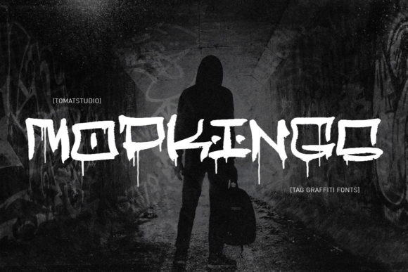
Mopkings: A Playful Display Font That Lifts Digital Branding
It started with a hero section redesign for a boutique coaching site — clean layout, warm photography, and that familiar “something’s missing” feeling in the headline. I swapped out the safe sans serif we’d been using and dropped in Mopkings. Instant lift. Not just visual — emotional. The client texted back within an hour: “This feels like *me*.” That’s when I knew Mopkings wasn’t just another display font — it was a quiet brand amplifier.
What Makes Mopkings Stand Out in a Web Layout
Mopkings is a hand-crafted display font with a cleverly balanced quirk: rounded terminals, uneven baseline rhythm, and subtle bounce in its letterforms — think friendly chalkboard energy meets polished editorial design. It’s not cartoonish, not overly retro, and never tries too hard. As a display font, it shines where personality matters most: headlines, section dividers, CTA buttons, and branded banners. Its charm lies in restraint — each character has intention, but none scream for attention. In web design terms, it creates strong visual hierarchy without sacrificing warmth or approachability.
How It Performs Across Devices and Contexts
I tested Mopkings across real-world scenarios: a product landing page with image overlays, a portfolio homepage with dark-mode toggle, and a course sales page with tight mobile spacing. On desktop, it anchors hero sections beautifully — especially over soft-focus backgrounds or textured gradients. At 48px and above, its open counters and generous x-height keep it crisp and legible even with light tracking. On mobile? It holds up well at 36px for headings, though I avoid going smaller than 32px in body-adjacent contexts (like subheads under feature cards). For buttons, it works best on medium-to-large CTAs — think “Enroll Now” or “Get the Guide” — but I skip it for tiny navigation labels or form inputs where clarity trumps character.
One unexpected win: Mopkings reads cleanly against both light and dark UI backgrounds. Its moderate stroke contrast and slightly softened edges prevent harsh halos or visual vibration. I used it over a deep navy gradient on a campaign landing page — no drop shadow needed, no readability loss. And because it’s well-hinted and available in modern webfont formats (WOFF2 included), load performance stayed smooth, even with custom font-display settings.
Smart Pairings for Real Digital Projects
Like any great display font, Mopkings thrives in contrast. I consistently pair it with a neutral, highly legible sans serif — think Inter, Manrope, or even system fonts like -apple-system for fast-loading sites. This combo delivers immediate personality *and* effortless scanning. For editorial-style blogs or brand kits with more texture, I’ve layered it with a gentle serif (like Cormorant Garamond) for pull quotes or section titles — the juxtaposition feels intentional, not chaotic.
What doesn’t work? Trying to force Mopkings into functional roles. I tested it for navigation menus and abandoned it by the second breakpoint — too much visual weight for small, repeated text. Same for form labels or error messages: clarity wins every time. And while its alternates and ligatures add delightful nuance (especially the swash ‘y’ and connected ‘th’), I use them sparingly — once per page, max — to preserve rhythm and avoid overwhelming users.
Practical Considerations Before You Implement
Before dropping Mopkings into a live site or client project, I always check three things: licensing, file support, and typographic flexibility. First — yes, it includes full commercial licensing for web use, including SaaS and client-facing sites. Second — the package delivers WOFF2, WOFF, and variable font options (where supported), plus desktop OTF/TTF files if you need SVG exports or design mockups. Third — it offers stylistic alternates and basic OpenType features, but no extensive language coverage beyond Latin-based scripts. If your audience includes multilingual users outside English, Spanish, French, or German, test key phrases early.
I also verify fallback behavior. In CSS, I declare it as a primary font with a carefully chosen stack: font-family: "Mopkings", -apple-system, BlinkMacSystemFont, "Segoe UI", Roboto, sans-serif; That way, even if the font fails to load, the tone stays modern and accessible — no jarring shifts to Times New Roman or monospace surprises.
Where Mopkings Adds Real Value Online
This font earns its place wherever digital presence needs to feel human-first. I’ve used it to refresh a creative agency’s portfolio headers — instantly communicating craft and confidence. On a seasonal product launch page, it gave holiday-themed banners a handmade, joyful edge without leaning into cliché. For a wellness coach’s opt-in banner, it softened clinical messaging and made “Join the Circle” feel inviting, not transactional. And in digital brand kits, it serves as the perfect signature element — the “voice” behind the logo, the punctuation in a story told through type.
What sets Mopkings apart isn’t just how it looks — it’s how it behaves. It doesn’t distract. It doesn’t fatigue. It doesn’t demand explanation. It simply makes digital spaces feel more like *places*, not pages. If your brand values authenticity over austerity, playfulness over polish, and connection over conformity — Mopkings might be the display font your next project has been waiting for.