Hogen Vantage: A Bold Display Font That Anchors Digital Branding
Last week, I was finalizing the hero section of a new landing page for a ceramicist’s online studio — minimalist aesthetic, warm neutral palette, hand-thrown product photography. The headline needed to feel grounded yet expressive: not cold, not fussy, but unmistakably human and intentional. That’s when I dropped Hogen Vantage into the mockup.
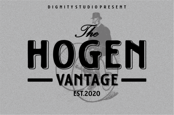
Right away, it clicked. Hogen Vantage is a thick, bold display font with tightly spaced, confident letterforms — no delicate serifs or airy gaps. It’s unapologetically present. The uppercase-heavy rhythm gives it that mid-century poster energy, but with enough optical balance to hold up cleanly on modern screens. It doesn’t whisper; it declares — without shouting. And in digital design, where attention is fragmented and first impressions happen in under two seconds, that kind of clarity matters.
I tested it across real scenarios: over a softly blurred studio background image, stacked beside a clean sans serif body font at 16px, scaled down for a mobile navigation toggle, and even as a subtle accent inside a newsletter CTA button. In every case, Hogen Vantage held its weight — not visually overwhelming, but always commanding just enough space to signal importance.
This isn’t a font you’d use for paragraphs or long-form reading. It’s built for impact: hero headlines, section dividers, course title cards, shop banners, campaign taglines, portfolio project labels. Think of it like a well-placed accent wall — it defines the room without needing to fill it.
On a coaching website I’m refining, I used Hogen Vantage for the main value proposition (“Clarity Starts Here”) above a short testimonial carousel. Paired with Inter for body text and captions, the contrast created immediate hierarchy — the eye lands on the statement first, then flows naturally downward. No extra animation or color shifts needed. Just smart typography doing its job.
Readability on mobile? Surprisingly solid — as long as you respect its nature. At 32px on desktop, it shines. At 24px on tablet, still strong. On mobile, I bumped it to 28px (with tighter tracking) and added subtle letter-spacing to prevent visual crowding. It stays legible even against textured backgrounds or soft image overlays — just avoid placing it directly over busy patterns or low-contrast gradients without a subtle drop shadow or background tint.
One thing I appreciated during implementation: Hogen Vantage comes with a full set of OpenType features, including stylistic alternates and ligatures — useful if you’re designing branded social assets or email headers where small typographic flourishes add polish. It also includes web-optimized WOFF2 files, so load times stay light. No render jank, no invisible text flashes — just smooth, consistent display across Chrome, Safari, and Edge.
Licensing is straightforward: commercial use is covered, and it supports Latin-based languages out of the box. If your audience includes Spanish, French, or Portuguese speakers, you’ll be covered for core diacritics. For broader multilingual needs (like Eastern European or Turkish), double-check the character map before committing to large-scale use — but for most boutique brands, creative studios, and service-based sites, it’s more than sufficient.
Font pairing is where Hogen Vantage really sings. Its personality is bold but not chaotic — so it pairs beautifully with restrained, highly legible sans serifs like Inter, Poppins, or Manrope for UI text, forms, and navigation. For a more editorial or tactile brand (think indie publishing, art direction, or slow-living blogs), try it with a warm serif like Cormorant Garamond or Literata — the contrast feels intentional, not accidental.
I avoided pairing it with other display fonts — no script, no ultra-thin caps, no geometric extremes. Hogen Vantage doesn’t need competition in the headline space. It’s the anchor. Everything else supports it.
In practice, I’ve used it across several contexts this month:
- A product landing page for a small-batch skincare line — Hogen Vantage for the hero title, then a lighter weight of the same family (where available) for subheads, keeping cohesion tight.
- A digital brand kit for a freelance illustrator — applied to cover slides, presentation headers, and social media banners, always paired with a neutral monospace for captions.
- A course sales page for a UX writing workshop — used only for the course name and “Enroll Now” button. Nothing else. The restraint made both elements feel more valuable.
- A portfolio homepage for a lettering artist — where Hogen Vantage appeared not just in headings, but subtly embedded in SVG illustrations as part of the artwork itself.
What surprised me most wasn’t how loud it is — it’s how trustworthy it feels. Strong typography quietly signals competence. When users see a well-set, purposeful headline, they subconsciously register care — in craft, in detail, in intention. That matters more than ever when building digital trust without face-to-face interaction.
It’s not the right fit for every brand. A fintech dashboard or a medical telehealth interface would feel off-kilter with Hogen Vantage — too much presence, not enough neutrality. But for makers, teachers, creatives, and independent service providers? It adds nostalgic warmth without leaning into retro cliché. It feels handmade, but digitally precise.
If you're evaluating display fonts for your next project, ask yourself: Does it serve the message — or just decorate it? Does it scale gracefully across devices? Does it pair cleanly with your body type? Does it load fast and license clearly? Hogen Vantage checks all four. It won’t solve weak content or poor layout — but in the right context, it makes strong work feel even more intentional.
And honestly? After weeks of testing, I haven’t replaced it once.