Homan: A Friendly Display Font for Digital Branding
It started with a hero section—just a clean image banner and a headline that felt flat. I’d been using the same safe sans serif for months across client landing pages, and while it worked, it didn’t *breathe*. So I opened my font library, scrolled past the usual suspects, and landed on Homan. Within five minutes, I’d swapped in its brushed, relaxed letterforms—and suddenly, the whole page felt warmer, more human, and quietly confident.
What Makes Homan Shine on Screen
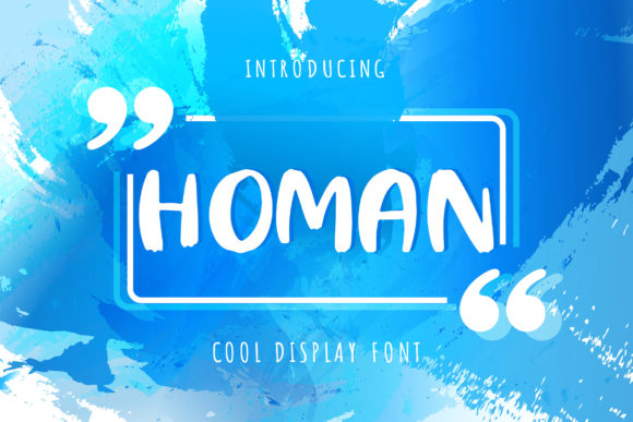
Homan is a display font—designed not for paragraphs, but for moments that matter: headlines, banners, call-to-action buttons, and brand signatures. Its subtle brush texture gives it tactile charm without sacrificing clarity. It’s neat (no wild flourishes), friendly (open counters, gentle contrast), and casually modern—like handwriting you’d trust to introduce your brand, not shout over it.
I tested it across real layouts: a boutique online store’s seasonal campaign banner, a coaching website’s “About” section header, and a digital course sales page where the headline needed to feel inviting—not intimidating. In every case, Homan added approachability while keeping visual authority. It doesn’t compete with imagery; it complements it. Over light backgrounds, its soft weight reads cleanly. Over muted photography or textured overlays, its slight irregularity adds depth—not distraction.
Responsive Behavior & Real-World Readability
Here’s what matters most when choosing a display font for the web: does it hold up at different sizes and on different devices? I checked Homan on mobile first—set as a 36px heading on a narrow viewport. It remained legible, with generous spacing and clear character distinction. The lowercase a, e, and s retain their friendly shape even when scaled down, and uppercase letters carry just enough presence for impact without heaviness.
On desktop, it shines at 48–72px for hero text—especially with letter-spacing tightened slightly (+20–40 units in CSS). But I wouldn’t use it below 28px for headings, and definitely not for body copy, navigation links, or form labels. Its decorative nature means it trades some functional precision for expressive warmth—and that’s intentional. Use it where you want emotion, not efficiency.
Smart Pairings for Balanced Web Typography
Homan thrives when paired thoughtfully. My go-to combination? Homan for headlines + Interline (or a neutral sans like Poppins or Manrope) for body text. The contrast works beautifully: Homan brings personality; the sans brings structure and scannability. For a more editorial feel—say, on a creative portfolio blog—I’ve paired it with a light serif like Lora or Playfair Display for subheads, letting Homan anchor the top-level message.
Avoid pairing it with other highly textured fonts or scripts—it can feel cluttered. And while it pairs well with minimalist icons or line art, steer clear of busy SVGs or dense photo collages directly beneath Homan text. Give it room to land.
Practical Considerations for Web Designers
Before dropping Homan into a live site or client project, I always check three things:
- Webfont availability: Make sure the vendor provides WOFF2 files (for speed) and includes fallback options in your CSS stack.
- Weight range: Homan comes in one primary weight—ideal for display use, but not for building typographic hierarchy *within* the font family itself. That’s fine—you’ll handle hierarchy with size, color, and spacing, not weight shifts.
- Licensing clarity: Confirm commercial web licensing covers embedded usage (e.g., via @font-face), especially for client sites or SaaS dashboards. Most reputable display font vendors do—but always verify.
I also test it with system font fallbacks in case loading fails. A well-crafted fallback stack—Homan, -apple-system, BlinkMacSystemFont, 'Segoe UI', sans-serif—keeps the tone consistent even before the custom font renders.
Where Homan Fits Best (and Where to Pause)
Homan excels in contexts where voice and vibe matter more than utility: landing page heroes, section dividers (“Our Approach”, “What Clients Say”), CTA buttons (“Start Your Journey”), testimonial quotes, and branded newsletter headers. On a portfolio site, it gave my “Work” section title quiet confidence. On a small business coaching site, it softened the “Book a Call” button just enough to lower perceived friction.
Where it doesn’t belong: dense dashboard interfaces, data tables, error messages, or any interface element requiring rapid scanning or accessibility-first clarity. Its brushed quality, while charming, reduces sharpness at tiny sizes—so skip it for breadcrumbs, caption text, or mobile menu items under 16px.
Also worth noting: Homan includes standard OpenType features—ligatures and stylistic alternates—but they’re subtle and optional. I’ve used them sparingly in logo lockups or hero text for extra polish, but never relied on them for core readability. They’re the cherry, not the cake.
Final Notes from Real Layout Testing
Homan isn’t flashy—but it’s memorable. It doesn’t try to be everything; it knows its role. In a landscape full of bold, geometric displays or ornate scripts, Homan stands out by being gently human. It helped me shift a client’s brand voice from “professional but distant” to “capable and kind.” That nuance matters—especially online, where first impressions happen in under two seconds.
If your digital brand leans into warmth, authenticity, or handmade energy—even if you’re selling software or services—Homan is a thoughtful, reliable choice. Just remember: let it lead the moment, then step back and let cleaner, simpler type carry the rest. That balance? That’s where great web typography lives.