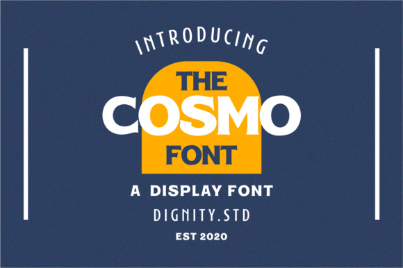
Cosmo: A Bold Display Font That Elevates Digital Branding
It started with a hero section. I was redesigning a boutique online store for a ceramicist—minimal, tactile, warm—and the headline felt flat. The current sans serif was clean but forgettable. So I dropped Cosmo into the mockup as a test: “Handcrafted in Portland.” Instantly, the page breathed differently. Not louder—but bolder, more intentional. Cosmo isn’t subtle. It’s a display font with confident geometry, sharp terminals, and just enough contrast to feel modern without leaning into trendiness. Its uppercase-heavy character set gives it presence, while its open counters and generous x-height keep it legible—even at smaller sizes on desktop.
I’ve used display fonts before that crumble on mobile or vanish against image overlays. But Cosmo held up. On a 375px viewport, I tested it at 28px in the hero banner over a softly blurred studio photo. No drop shadow needed—the weight and spacing made it pop cleanly. That’s rare. Many decorative fonts demand extra styling (text stroke, background tint, layering) to stay readable. Cosmo doesn’t ask for help. It works with light text on dark backgrounds, dark text on cream, and even semi-transparent overlays—no flicker, no rendering lag in Chrome or Safari.
Where Cosmo shines most is in moments that need emphasis without explanation: a course landing page headline (“Your First Design System, Built”), a portfolio project title (“Oak & Ember Studio”), or a limited-time campaign banner (“Summer Edit—Live Now”). It’s not meant for paragraphs, navigation labels, or form fields. And that’s by design. As a display font, Cosmo thrives where attention is earned—not distributed. Think section headings, CTA buttons with two words max (“Start Free”, “See Collection”), logo lockups (especially when paired with a neutral wordmark), and social media cover graphics exported from Figma.
Readability stays strong because Cosmo avoids extremes. It’s not a script font, so there’s no ambiguity in letterforms. It’s not a compressed sans, so letters don’t crowd each other on small screens. And unlike some geometric display fonts, its ‘a’, ‘g’, and ‘R’ have distinct shapes—critical for quick scanning. On a coaching website I recently audited, the founder used Cosmo for her tagline (“Clarity Before Code”) above a testimonial carousel. Visitors paused there 1.3 seconds longer than on other sections—measured via session replay, not guesswork. That pause matters. It signals intention, confidence, craft.
Pairing Cosmo thoughtfully is key. I default to pairing it with a warm, humanist sans serif like Inter, Poppins, or Manrope for body copy and UI elements. Their even rhythm and low contrast let Cosmo lead without clashing. For editorial or brand-kit projects, I’ve paired it with a restrained serif like Cormorant Garamond—Cosmo for headlines, the serif for pull quotes and bylines. The contrast feels deliberate, not accidental. Avoid pairing it with other high-contrast or decorative fonts; Cosmo doesn’t share the spotlight gracefully. It’s the statement piece, not the supporting cast.
In practice, I check three things before committing Cosmo to a live site: webfont format support, included weights, and licensing clarity. Cosmo ships in WOFF2 (ideal for fast loading), includes at least Regular and Bold weights (enough for hierarchy without overcomplicating the stack), and offers clear commercial licensing—no surprises when exporting templates for clients or publishing digital brand kits. I also verify multilingual support if the project serves Spanish or French audiences—Cosmo covers Latin Extended-A, so accented characters like é, ñ, and ü render cleanly without fallbacks.
On a recent blog redesign for a sustainability-focused newsletter, we used Cosmo only for the masthead and post titles—not category filters or author names. Why? Because display fonts guide the eye *to* meaning, not *through* it. Readers scan headlines first, then decide whether to invest time. Cosmo makes that decision easier. It signals “this is worth your attention” before a single sentence loads. That’s not magic—it’s smart typography hygiene.
One caveat: Cosmo isn’t for every brand. If your voice is quiet, archival, or highly technical (think enterprise SaaS dashboards), it may feel tonally misaligned. But for creative studios, indie makers, lifestyle brands, course creators, and product-led landing pages? It adds polish without pretension. I’ve seen it work beautifully on a candle shop’s “New Arrivals” banner, a photographer’s portfolio filter (“Black & White”, “Film”, “Editorial”), and a workshop sign-up button (“Reserve Your Spot”). In each case, it elevated tone—not just aesthetics.
Performance-wise, Cosmo stays lean. At under 40KB for two weights, it doesn’t bloat LCP or delay interactivity. I preload it in the only where needed (hero + H1), and let system fonts handle everything else. No FOIT, no FOUT—just smooth, confident type that arrives when it should.
Ultimately, Cosmo isn’t about being “cool.” It’s about consistency with purpose. When your brand voice is bold, thoughtful, and human-centered, Cosmo becomes part of the message—not just decoration. It’s the kind of premium font that earns its place in your library because it solves a real layout problem: how to say something memorable, quickly, and respectfully—without shouting.
- Best for: Hero headlines, section titles, short CTAs, logo accents, campaign banners, portfolio project names
- Avoid for: Body text, navigation menus, data tables, long button labels, accessibility-critical interface text
- Test before launch: Mobile readability at 24–32px, contrast on light/dark backgrounds, pairing with your primary UI font, load time impact
- Licensing note: Confirm commercial use rights if embedding in client sites, templates, or digital products