Rekt: A Bold Display Font That Commands Attention Online
It started with a hero section. I was refining the homepage for a boutique coaching brand—clean aesthetic, warm photography, intentional whitespace—and the headline just felt… polite. Too safe. So I swapped in Rekt. Instantly, the layout snapped into focus. Not louder, exactly—but bolder, sharper, more decisively *there*. That’s when I knew this wasn’t just another display font. It was a visual anchor.
What Rekt Brings to Digital Layouts
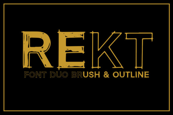
Rekt is a premium display font built for impact—not decoration. Its sharp angles, high contrast, and confident weight give it presence without aggression. Think of it as the typography equivalent of a well-tailored blazer: structured, intentional, and quietly commanding. It’s not trying to be friendly or whimsical—it’s designed to communicate clarity, confidence, and creative authority. In web design terms, that translates to stronger visual hierarchy, faster scanning, and immediate brand distinction—even before a visitor reads a single word.
How It Performed in Real Layout Tests
I tested Rekt across multiple contexts: a product landing page for a digital course, a portfolio site’s project thumbnails, a small business blog header, and a campaign microsite banner. On desktop, its sharpness shines—especially over subtle image overlays or muted gradients. At 48px and above, letterforms hold their integrity beautifully. On mobile? I used it at 36px for hero headlines and found it remained legible and impactful—even on smaller OLED screens—so long as line height stayed generous (1.3–1.4) and contrast met WCAG AA standards.
One standout moment: placing Rekt over a softly blurred background photo. Where other bold fonts blurred or lost definition, Rekt’s clean terminals and precise stroke endings kept edges crisp. No haloing. No visual bleed. Just confident, grounded typography.
Where Rekt Excels—and Where to Pause
Rekt thrives in short-form, high-impact roles:
- Hero section headlines and subheads
- Section dividers (“Our Approach”, “What You’ll Learn”)
- CTA buttons (when styled with ample padding and contrast)
- Logo text or wordmarks for creative brands
- Digital ad banners and social media cover graphics
It’s intentionally *not* built for body copy, navigation menus, form labels, or dense dashboard interfaces. Its decorative strength becomes a liability there—reducing scan speed and increasing cognitive load. I avoided using it below 24px entirely, and never for anything requiring sustained reading. For accessibility and usability, that boundary matters.
Pairing It Thoughtfully for Web Use
The magic of Rekt isn’t in isolation—it’s in contrast. I paired it consistently with a neutral, highly legible sans serif (like Inter or a well-hinted version of Helvetica Neue) for all body copy, captions, and UI elements. The juxtaposition works because Rekt handles the “what” (the idea, the emotion, the hook), while the sans serif handles the “how” (clarity, function, trust). For a slightly more editorial feel—say, on a thought-leadership blog—I tested it with a restrained serif (such as Lora or Literata) for pull quotes or bylines. The result felt elevated but never fussy.
Crucially, I checked what was actually included: Rekt ships with a single bold weight and standard OpenType features—no italics, no light variants, no extensive language support beyond basic Latin. That’s fine for most English-first digital projects, but I double-checked multilingual client needs before committing. Also confirmed: the webfont files (WOFF2) loaded quickly—under 20KB—and rendered consistently across Chrome, Safari, and Firefox.
Practical Tips Before You Implement
If you’re considering Rekt for your next site or client project, here’s what helped me:
- Licensing first: Verify commercial web use rights—especially if embedding in SaaS dashboards, templates, or white-labeled tools.
- Test contrast early: Run your chosen color combo through a free contrast checker. Rekt’s sharpness can exaggerate poor contrast.
- Reserve it for hierarchy: Use it for one primary typographic role per page—never stack it with other decorative fonts.
- Check rendering on iOS: Some display fonts soften on Safari; Rekt held up well, but always preview on device.
- Optimize fallbacks: Declare system-ui or a sturdy sans as fallback—no surprises if the font fails to load.
At its best, Rekt doesn’t just sit on a page—it shapes how users perceive the brand behind it. It signals intention. It supports storytelling without competing with it. And in a digital landscape saturated with safe, algorithm-friendly type, that kind of quiet confidence is rare—and valuable.